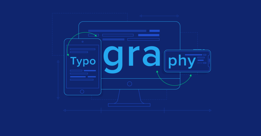
Responsive Typography in Modern Web Design
Text is the foundation of any website. But in today’s world of diverse devices and screen sizes, ensuring that text remains clear, legible, and aesthetically pleasing across all platforms is no small feat. This is where responsive typography steps in, like a superhero wielding the power of adaptable fonts and flexible layouts. Let’s explore the world of responsive typography and discover how to craft websites where words not only look beautiful but also deliver an optimal reading experience for every visitor.
In the dynamic world of web design, where user experience reigns supreme, responsive typography has emerged as a pivotal element in crafting visually appealing and accessible websites. As the digital landscape evolves with an array of devices and screen sizes, the need for typography that adapts seamlessly to different environments has become more critical than ever before.

Understanding Responsive Typography
Responsive typography refers to the practice of designing text to be easily readable and aesthetically pleasing across various devices and screen sizes. Unlike traditional fixed typography, which may appear too small or too large on different screens, responsive typography adjusts dynamically to maintain optimal readability and visual balance.
From Static Screens to a Fluid Web: The Challenge of Responsive Design
Traditionally, web design was a one-size-fits-all affair. Websites were designed for a specific screen size, and that was that. But the rise of smartphones and tablets shattered this paradigm. Imagine a website with beautiful typography that becomes an unreadable mess when shrunk down to a mobile screen. Responsive typography tackles this challenge head-on, ensuring that text adapts seamlessly to any device, providing a frustration-free reading experience for all users.
The Art of Scalability: Fonts that Dance and Resize
The cornerstone of responsive typography is scalable fonts. Imagine a website that utilizes fonts that can adjust their size dynamically based on the screen size. This ensures that headlines remain prominent on desktops while gracefully scaling down for optimal readability on mobile devices. Scalable fonts, like Open Sans or Roboto, are essential tools in the responsive typography toolbox.
Finding Harmony in the Chaos: Media Queries for Typographic Precision
Media queries are the secret code that unlocks the power of responsive typography. Imagine a website where CSS media queries dictate how fonts behave at different screen widths. These media queries allow designers to define specific font sizes, line heights, and even letter spacing for various screen sizes, ensuring a harmonious typographic experience across all devices.
Farewell, Fixed Sizes: Embrace Relative Units for Fluid Design
Responsive typography demands flexibility. Imagine a website that abandons fixed font sizes in pixels in favor of relative units like ems or rems. These relative units allow fonts to scale proportionally to the base font size, ensuring a consistent and fluid reading experience across different screen sizes. By embracing relative units, designers can create truly responsive typography that adapts beautifully to any device.
Line Height Takes Center Stage: Ensuring Readability Beyond Font Size
Font size is just one piece of the puzzle. Line height, the space between lines of text, is equally crucial. Imagine a website where line height is carefully considered to ensure optimal readability. Responsive typography dictates adjustments to line height alongside font size, preventing text from becoming cramped or too spread out on different screens.
The Power of White Space: Giving Text Room to Breathe
Even the most beautiful fonts need room to breathe. Responsive typography recognizes the importance of white space, the space between lines and paragraphs of text. Imagine a website where white space is adjusted alongside font size and line height on different devices. This ensures optimal readability and prevents text from becoming overwhelming on smaller screens.
Responsive typography isn’t just about technical wizardry; it’s about creating a seamless and enjoyable reading experience for every user, regardless of their device. By mastering the art of scalable fonts, media queries, and relative units, web designers can craft websites where text becomes more than just content – it becomes a captivating visual element that draws users in and keeps them engaged. So, the next time you’re designing a website, remember the power of responsive typography. With a little planning and these essential techniques, you can ensure your website’s words look and feel amazing on any screen.